Tutorial: Visual Studio 2017 + Angular 4 = SharePoint Online add-in
However, what about “true” Visual Studio? Will we receive any gains in using it with Angular 4 in comparison to other lightweight code editors like VS Code?
In the following tutorial article, Oleksandr Shapoval, Infopulse .NET expert would like to shed some light on the practical advantages of the newest Microsoft Visual Studio 2017 in the context of SharePoint add-ins development with Angular 4.
Development environment setup
PSA: the source code of the sample demonstration project is available on GitHub.
For starters, let’s proceed with setting up our development environment.
Visual Studio 2017. First things first, we need deployment of the latest version of Visual Studio – you can download it from the official website. You may select the most appropriate version for your needs – please find the detailed version comparison on the relevant page. We recommend using VS Professional since it allows working with commercial projects and comes bundled with lots of project templates required for the most common tasks.
Visual Studio 2017 offers a bunch of project templates for SharePoint out-of-the-box and supports various SharePoint versions. Based on these templates, you may create both a classic On-Premise application solution for SharePoint 2013/2016, as well as a lightweight add-in for SharePoint Online. However, these templates are mostly suitable for ASP.NET-based or “clean” web development.
In order to have a code development environment ready for Angular-based app development, we’ll need to install several additional components and slightly enhance projects structure.
Node.js + NPM. Download Node Package Manager (NPM) and install it together with Node.js from the official website. Both components are provided in a single installation file with a simple click-forward installation approach. Thus, you shouldn’t have any issues with its installation in the Windows environment.
Webpack. Now, you’ll need a module bundler. Out of our experience, we recommend using Webpackwith basic setup. In order to install it, execute the following command from the Command Prompt or Package Manager Console in Visual Studio:
npm install –save-dev webpack
An advanced setup can be found on the official WebPack page on npmjs.com.
SharePoint Online. Finally, yet importantly, we need a sandbox – a new and shiny SharePoint Online site. For this demo, we’ll use a free trial Office 365 E3 environment. A detailed description of creation process you may find in a wonderful guide written by Chris O’Brien. You may skip the 2nd part of the article referring to the creation of Azure VM if you are planning to use your own desktop as a basic development environment.
Important! Please note that for development purposes you will need to create a separate site collection based on development site template. This step is required for error free deployment from Visual Studio.
As for the setup of local IIS for the new SharePoint Framework, it is now redundant as well, since we are planning to write client-only code.
Project setup
Now it is time to setup project structure for the add-in.
Template-based creation
As a basis for the Angular-based add-ins, currently, we are using a standard “SharePoint Add-in” template. After connection to the sandbox site, selection of the hosting model (for this demo a SharePoint-hosted add-in was selected) and confirmation of the SharePoint version (currently SharePoint 2013, 2016 and Online are supported), we’ll get the following a solution structure, as shown in Picture 1 below:
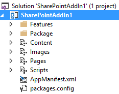
Picture 1. OOTB structure of the solution
Structure modification
In order to convert our freshly created add-in project into an Angular 4-based, we’ll need to make a few modifications:
- Add configuration files (package.json, tsconfig.json, config folder for other miscellaneous configuration files);
- Add Angular app folder for the components and modules storage;
- [OPTIONAL] Create an index.html page with app tag and connections to the script files to make some local tests;
- Execute npm install command in Add-in project folder in order to download all basic packages that solution is dependent on. The list of dependencies is listed in json file.
After these operations, the structure of our sample solution should look as shown Picture 2:
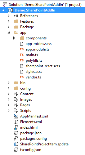
Picture 2. Modified solution structure
The main idea is to have a solution, which has its source files written separately in TypeScript and compile them into executable JS files that are automatically transferred to the mapped “Scripts” folder. Since a set of compiled files is the same, we can include them into the feature definition.
Setup dependencies
In order to achieve constant compilation and substitution of the files in project Scripts folder, an additional setup of webpack is provided. In package.json there’s a special section for the setup of continuous bundling and copying activities after execution of npm start or npm build commands.
"scripts": {
"start": "webpack  --config config/webpack.dev.js --progress --colors  --watch",
"test": "karma start",
"build": "webpack --config config/webpack.prod.js --progress --profile --bail"
}
The detailed configuration of this action, as you see, can be found in config/webpack.[mode].js files (depending on the execution mode).
As a result, after modification of any project files, a developer can start deploying activities right from Visual Studio without any extra steps for files substitution.
Development of basic functionality
For demonstration purposes, we will add a list reading functionality.
We’ve created a custom list, which should contain some basic tasks. A detailed application list structure is shown in the table below:
Field
Data type
Description
ID
Number
Default SharePoint field. Contains item unique identifier in list.
Title
Text
Default SharePoint field. Contains item title.
Status
Choice
Custom field. Contains next options: New, In Progress, Done
Now, our app structure has expanded with new modules/components:
- SharedComponents – a technical module that is left blank, but may later be filled with common composite components that can be used all-around the app modules/components.
- TasklistModule – a module, containing the TasklistComponent, created for building a grid, which will display tasks in a list form on the app page.
- TaskService – a class that encapsulates business logic for data extraction from a SharePoint list.
- TasklistModel – a class, which provides a shell for service logic in order to inject it into other app components and executes call for data retrieval in an asynchronous manner.
- ITaskPage, ITask – model classes, abstracting domain model of the demo
Components/modules interrelations are shown in Picture 3 below:
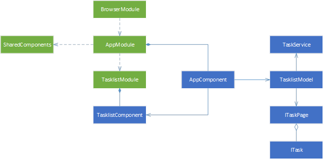
Picture 3. Demo app structure diagram
As a result, we shaped our solution into the following project files structure as shown in Picture 4:
Picture 4. Project structure with list reading functionality
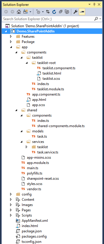
Permissions setup
Before the application first run, we will need to define add-in permissions, such as reading information from the lists or SharePoint services. A full list of possible permissions and usage levels can be found in Office Dev Center documentation. It can be achieved easily via Visual Studio in AppManifest.xml file, as shown in Picture 5 below:
Picture 5. SharePoint add-in permissions setup
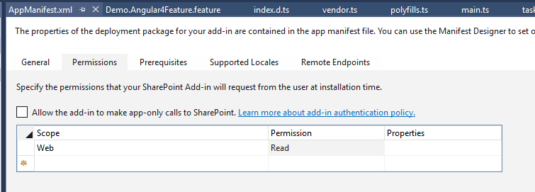
After setting up permissions, our add-in will be able to get access to the resources it needs.
Additionally, during each deployment/installation process you will receive the following convenient prompt with all details on what resources are requested by the application, as shown in Picture 6 below:
Picture 6. Add-in trust confirmation
UI bells and whistles
When it comes to the presentation of add-in functionality to an end user, it is nice to provide nice and sleek experience. For demonstration purposes, we’ve taken a third-party Angular 2 Data Table module that contains a component for displaying data items in a grid.
Additionally, this case also demonstrates the backward compatibility of an app, based on Angular 4 with referenced components that haven’t been migrated from Angular 2 yet.
Below you will find detailed steps for this component setup (please refer to the official components page on GitHub for more examples).
In order to connect data table to the application solution, we will need to download module files first. To do that, add the following properties to the package.json file:
{
     ...,
       "dependencies": {
     ...
       "angular-2-data-table": "0.1.0",
     ...
     },
...
}
Now, we will need to add import of the properties to app.module and tasklist.module:
...
  import { DataTableModule } from 'angular-2-data-table';
   @NgModule({
     ...
        imports: [
      ...,
          DataTableModule
     ],
...
})
We will add DataTableResource object into Tasklist component in order to prepare tasks collection for displaying data inside the table:
...
  import { DataTableResource } from 'angular-2-data-table';

  @Component({
        selector: 'tasklist',
        template: require('./tasklist.html')
  })

  export class TasklistComponent implements AfterViewChecked, OnChanges {
         @Input() tasks: ITask[];
         itemResource = new DataTableResource(this.tasks);
         itemCount = 0;
         items: ITask[];

   constructor() {
         this.itemResource.count().then(count => this.itemCount = count);
   }

  ...
 }
Data table insertion into Tasklist component markup:
Additional styles for proper displaying of the table inside Tasklist component:
:host /deep/ .data-table-row {
       cursor: pointer;
      -webkit-user-select: none;
      -moz-user-select: none;
      -ms-user-select: none;
       user-select: none;
}
As a result, we shaped our application solution into the following project files structure as shown Picture 7 below:
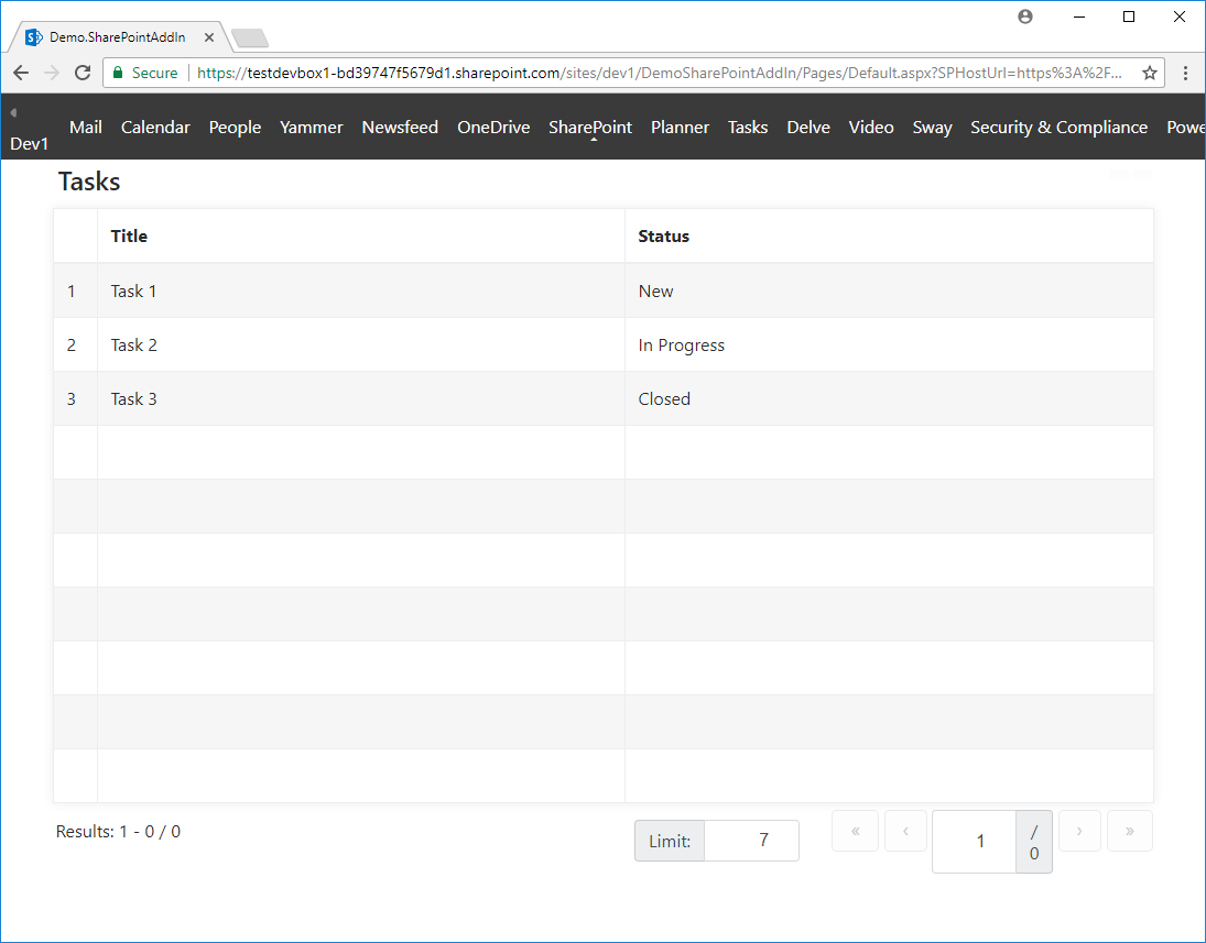
Picture 7. Final UI of the demo add-in
In today’s modern development approaches for the SharePoint platform, there are tendencies to use lite cross-platform code editors for the development of client-side add-ins. However, as we have shown with our project, the classic Visual Studio is very much capable to provide high-end experience with its constantly expanding built-in functions. In addition, if you, as a developer, need to use any third-party open-source tools and/or components, you are totally free to do it with Visual Studio!
As a reminder, we’ve uploaded the source code of this project to GitHub. Feel free to comment or ask your questions – we’ll be happy to talk to you!
What is SharePoint Online?
![Power Apps Licensing Guide [thumbnail]](/uploads/media/thumbnail-280x222-power-apps-licensing-guide.webp)
![How to Build Enterprise Software Systems [thumbnail]](/uploads/media/thumbnail-280x222-how-to-build-enterprise-software-systems.webp)
![Super Apps Review [thumbnail]](/uploads/media/thumbnail-280x222-introducing-Super-App-a-Better-Approach-to-All-in-One-Experience.webp)
![ServiceNow and Third-Party Integrations [thumbnail]](/uploads/media/thumbnail-280x222-how-to-integrate-service-now-and-third-party-systems.webp)
![Cloud Native vs. Cloud Agnostic [thumbnail]](/uploads/media/thumbnail-280x222-cloud-agnostic-vs-cloud-native-architecture-which-approach-to-choose.webp)
![DevOps Adoption Challenges [thumbnail]](/uploads/media/thumbnail-280x222-7-devops-challenges-for-efficient-adoption.webp)
![White-label Mobile Banking App [Thumbnail]](/uploads/media/thumbnail-280x222-white-label-mobile-banking-application.webp)

![Mortgages Module Flexcube [Thumbnail]](/uploads/media/thumbnail-280x222-Secrets-of-setting-up-a-mortgage-module-in-Oracle-FlexCube.webp)
![Challenges in Fine-Tuning Computer Vision Models [thumbnail]](/uploads/media/thumbnail-280x222-7-common-pitfalls-of-fine-tuning-computer-vision-models.jpg)